HOLLYFRONTIER CORPORATION WEBSITE

Refreshing HollyFrontier Corporation's Digital Space
As the principal design lead for this project, I was briefed by the client to create an updated user interface for HollyFrontier's corporate website was intuitive, accessible, and showcases the company's vibrant visual identity. The goal was to define the gaps within the current HFC website and address key user pain points to create a functional and visually appealing web presence.
Defining the Pain Points
Too many navigation options
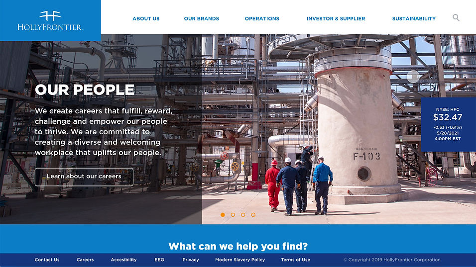
One of the main issues with the current HFC website is the overuse of navigation (nav) options that is complicated for users to maneuver through, and would often hide key pages. We have identified a total of 3 tiers of navigation: (1) the global nav, which categorizes main sections of the website (2) the secondary nav, which exists on each main landing page (3) a tertiary nav located directly below the secondary nav to highlight key points in the page.
Clashing information architecture
A key pain point expressed by users is the difficulty of finding information on the website. This challenge stems from the website's unintuitive information architecture that is a result of irrelevant pages/information being grouped together and ambiguous naming heuristics. This inevitably results in gaps within the user's information-seeking process, leading to frustration and hinders usability.
Design Solutions
Low Fidelity Wireframe
We aimed to address the defined challenges by working through iterations of a low-fidelity wireframe of the website. Working with stakeholders and users, we developed a new information architecture blueprint that was tested through the low-fidelity wireframe.
This step allowed us to actively incorporate feedback and make appropriate adjustments to the basic visual layout of the website.
As navigation was a challenge to many users, we decided to feature an optimized embedded search engine as a focal point on the website.


High Fidelity Wireframe
The high-fidelity wireframe stage allowed us to refine the website's visual space. The goal of the high fidelity wireframe was to highlight HFC's vibrant branding, which we have done so by employing a color-blocking aesthetic to ensure that the company's brand colors are featured prominently throughout the website.


For the overall style of the user interface design, we aimed to keep the look cohesive to other HFC branded materials. We maintained the "boxy" HFC brand style and kept lines straight and corners sharp. However, we wanted to introduce a dynamic element to the design by rounding out the edges of interactive elements. This allows buttons, search bars, drop-down menus, etc., to stand out against the rest of the UI.